I am among the millions of Apple’s iOS Music App and Podcast App users. I am certainly not only one who struggles with the design dissonance in their app. Here are my top 2 rants:
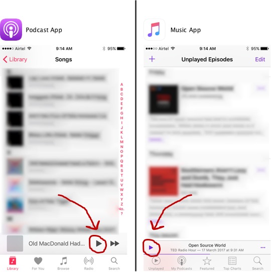
Design Dissonance in Location of Play Button

The Play buttons are in opposite positions. I always have to look and think where to click. This does not allow for muscle memory for someone using both apps very frequently. What happened to “Don’t Make Me Think“?
Feature Disparity

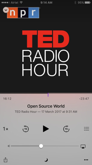
Podcast app provides two extremely useful features:
- Sleep
- 15 second skip forward or skip back
None of these are there in the Music app. Folks often go to sleep listening to music (a la Podcast) and need this function. Everybody like to revisit that beat or the clever wordplay. So skip back is a cool and useful feature to have.
Product Management Failure
Both cases are symptoms of failure of Product Managers.
It is as if the Product Managers of Podcast App and Music App don’t talk to each other or don’t like each other enough not to learn from each other.
It is also the failure of the Product Manager of Apple’s App not to drive Design Cohesion across the app that Apple builds.


